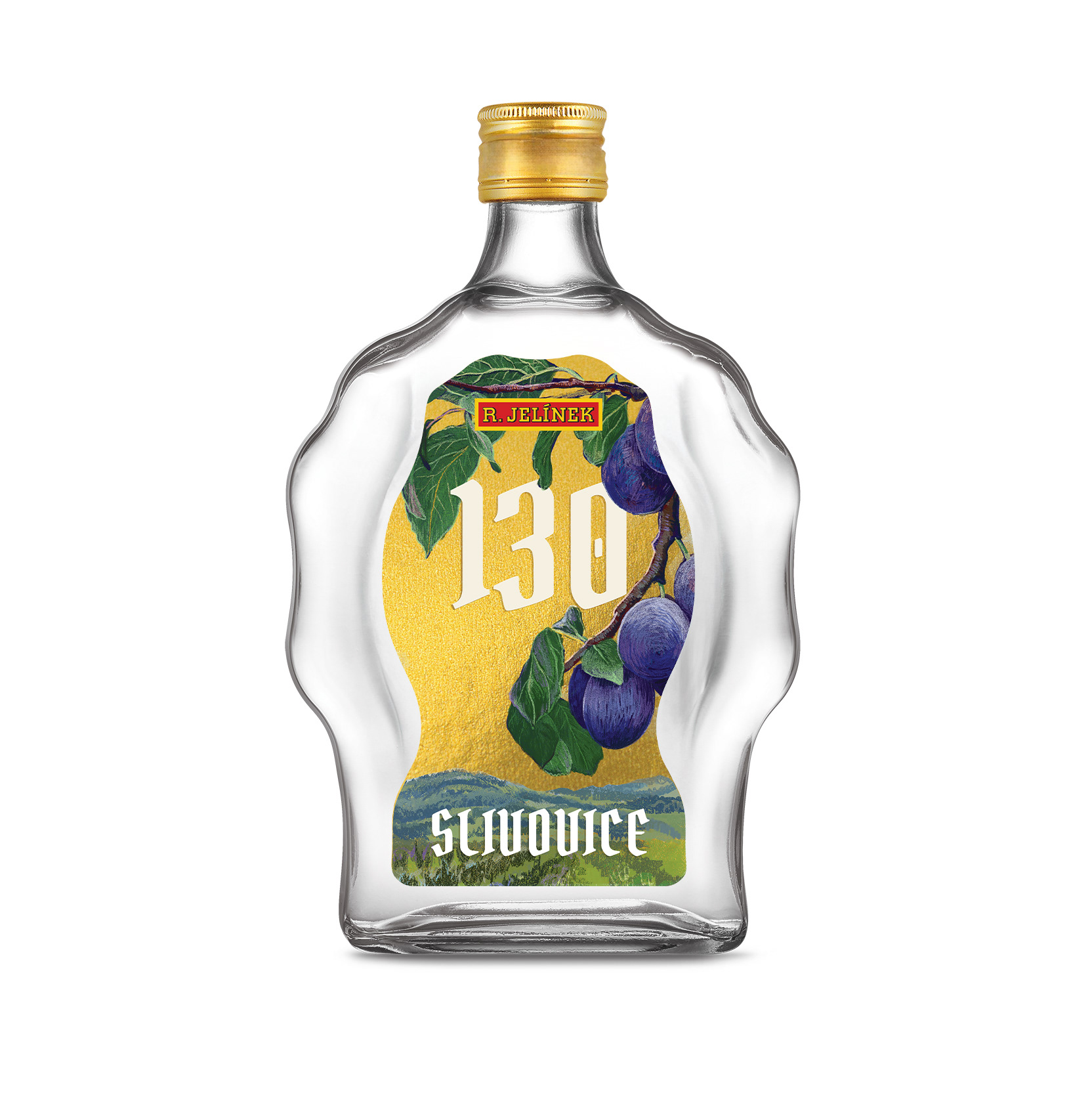
The central design features illustrations of plums and the Vizovice hills, specifically the orchards owned by the distillery’s proprietor. The golden background adds a festive touch and complements the color of the cap perfectly. The chosen font, Pirata One, is based on Gothic capital letters. It’s traditional, highly legible, timeless, and works harmoniously with the shape of the label and bottle. It also contrasts with the font used in the logo, ensuring that the graphic elements on the label remain cohesive and unobtrusive.
