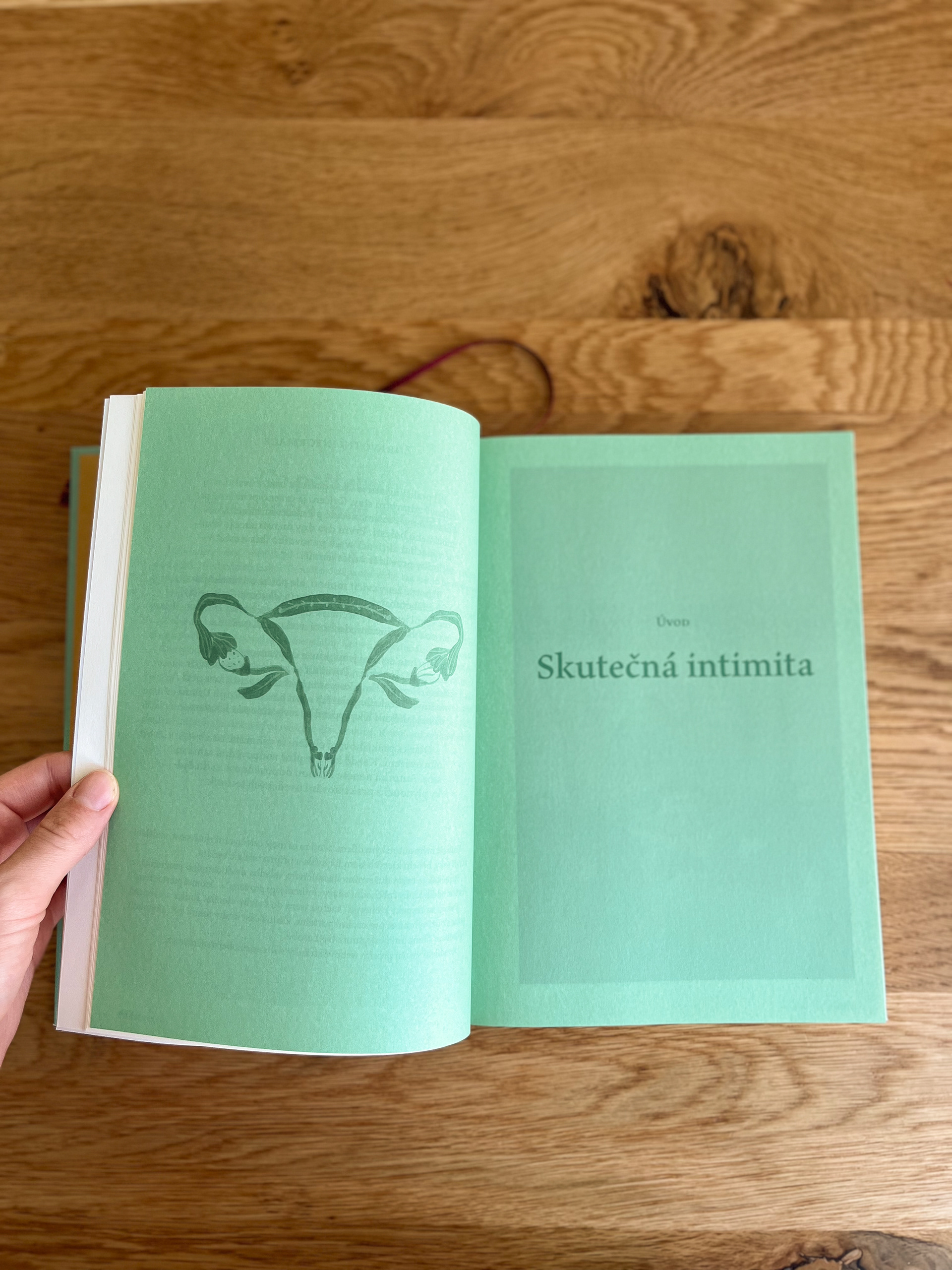
The photos for the book had already been taken, and I liked them. It was up to me to complement the book with small motifs, interpret it graphically, and bring it to life.
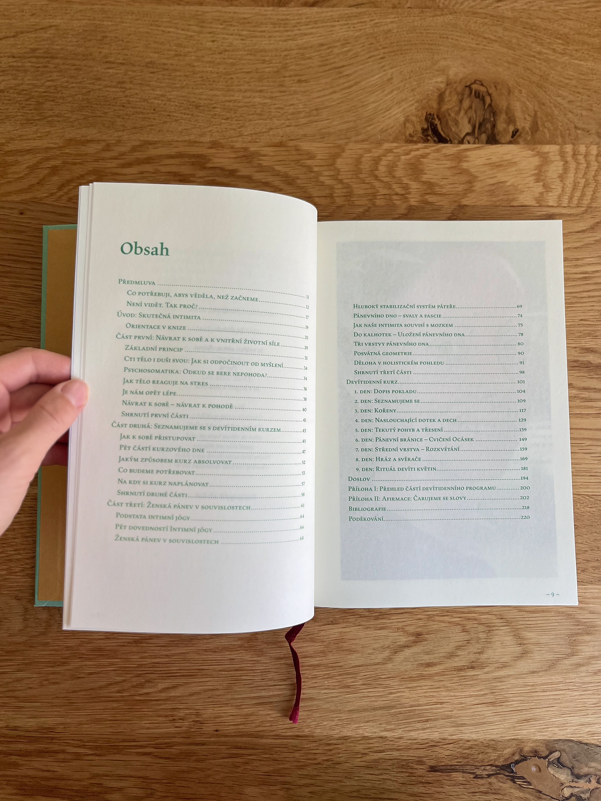
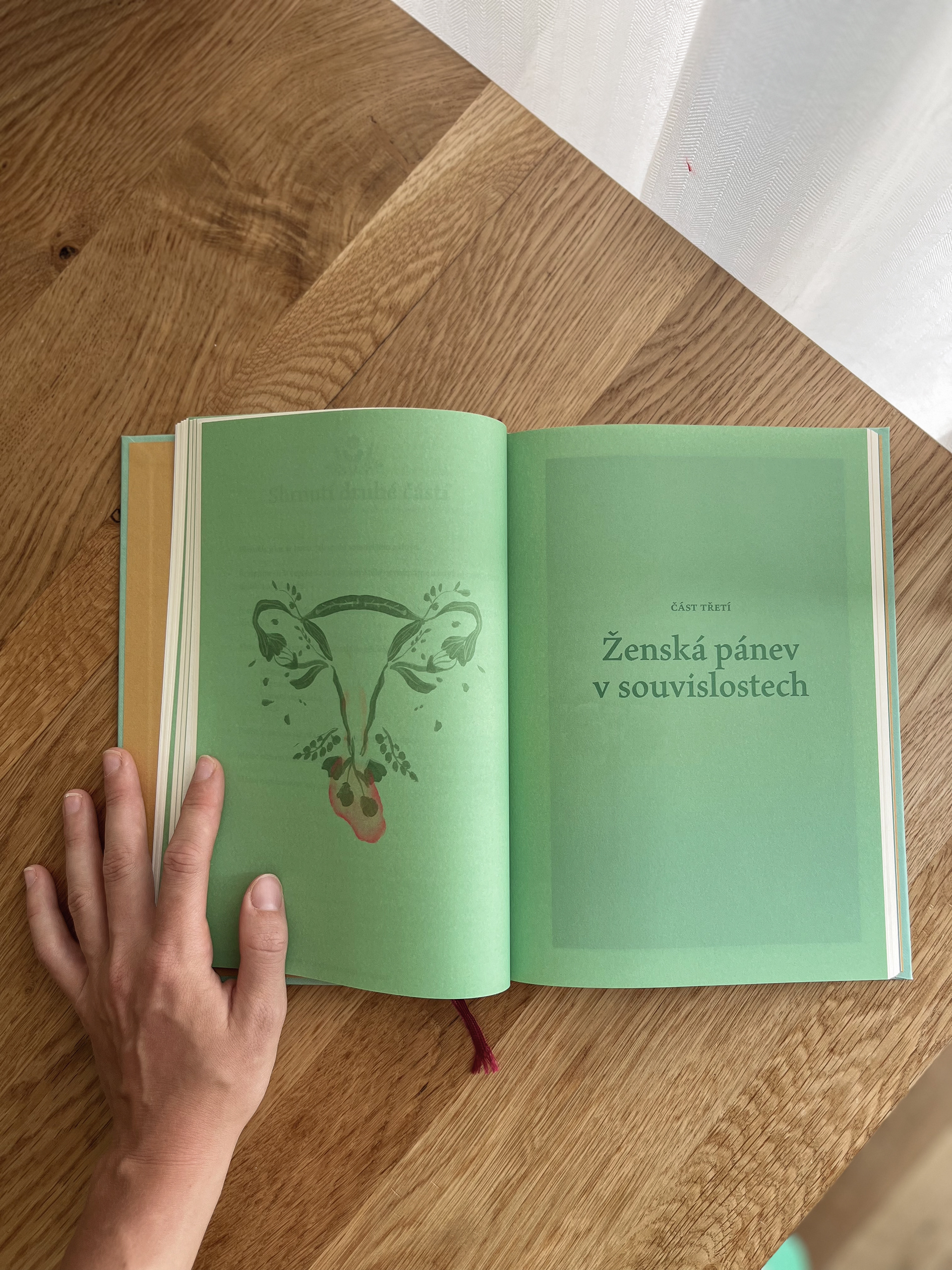
To be honest, I’ve been working with InDesign for a long time, but I had never dealt with nearly 50 paragraph styles before. Since the book is primarily educational, it was important to bring structure to it without overwhelming it with embellishments or mandalas, given the content. I think we succeeded in finding the right balance, and to my great joy, both Adéla and I were extremely satisfied with the final result.
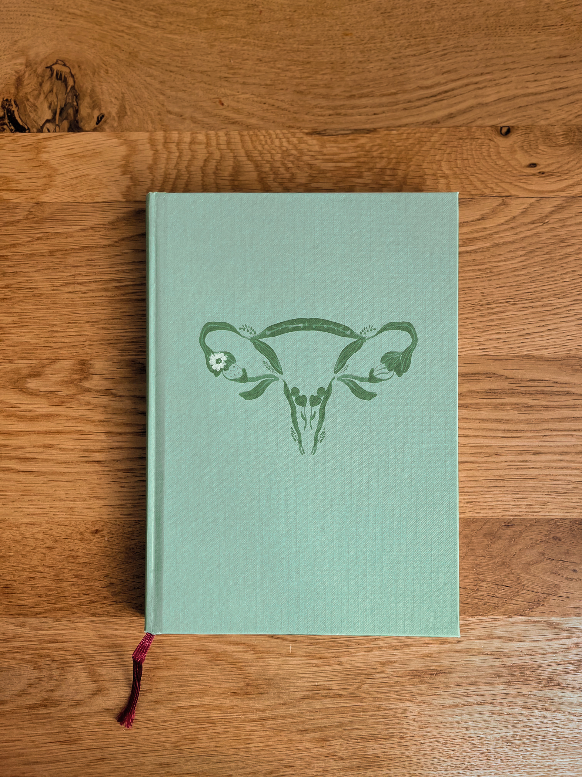
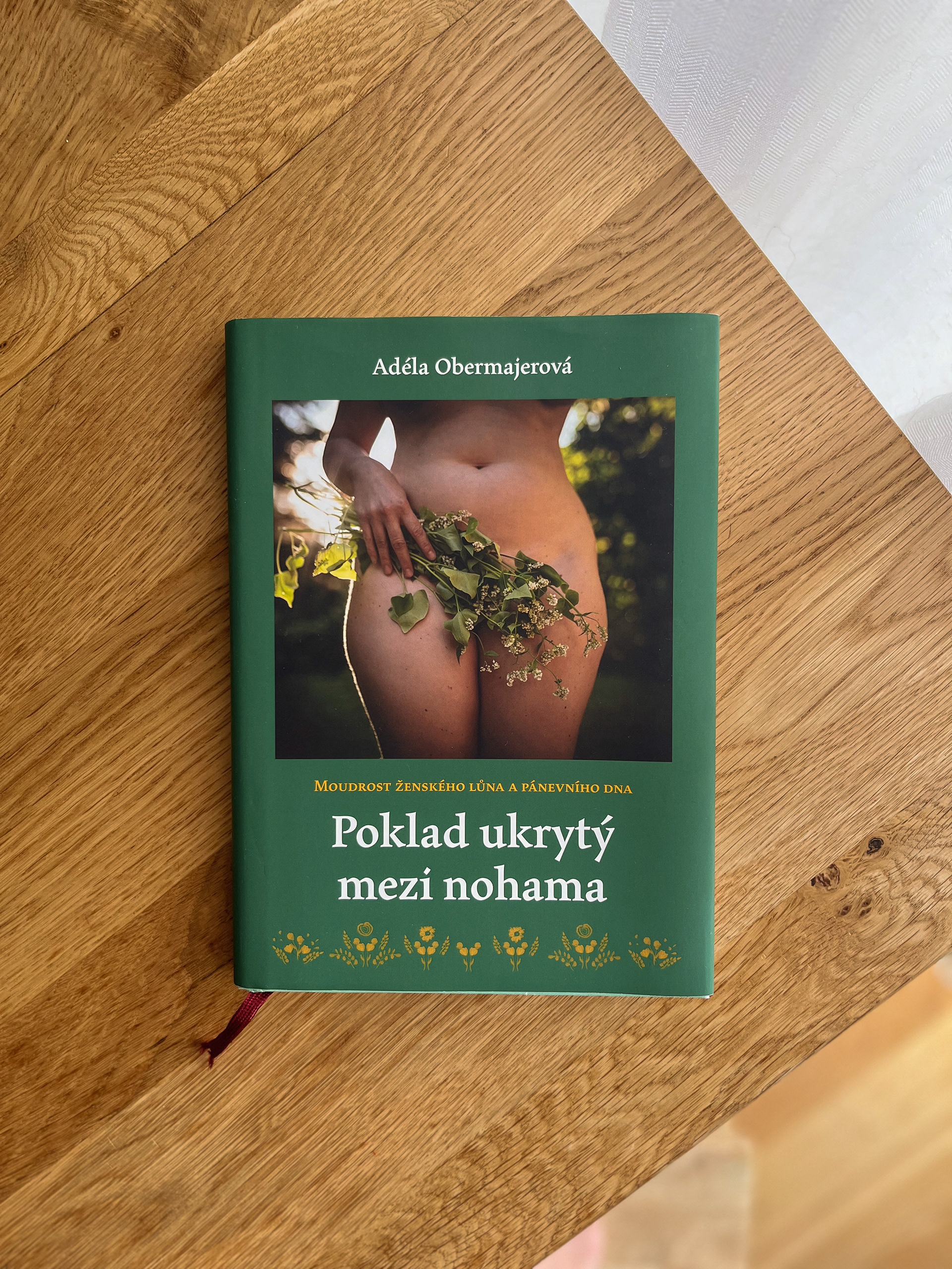
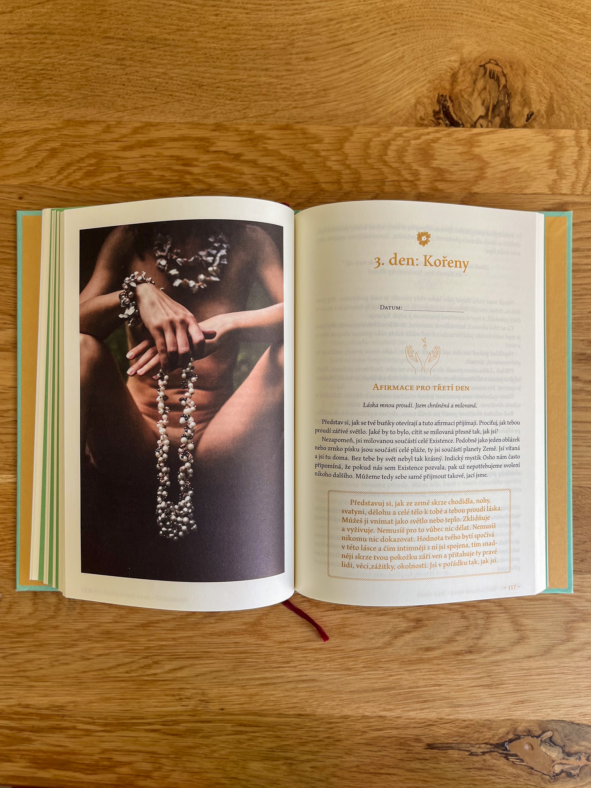
For a long time, we debated what the cover and endpapers should look like. Of course, we also had to stick to the budget. The canvas imitation works really well with the green illustration, and I believe the cover will catch the eye of many readers. The choice of paper was also very important to me. We both wanted the most natural paper with texture, but we also had to consider the large-format photos, which play a key role in the book.
I think we managed to find the right balance in the design of the book, and to my great joy, both Adéla and I were extremely satisfied with the result.