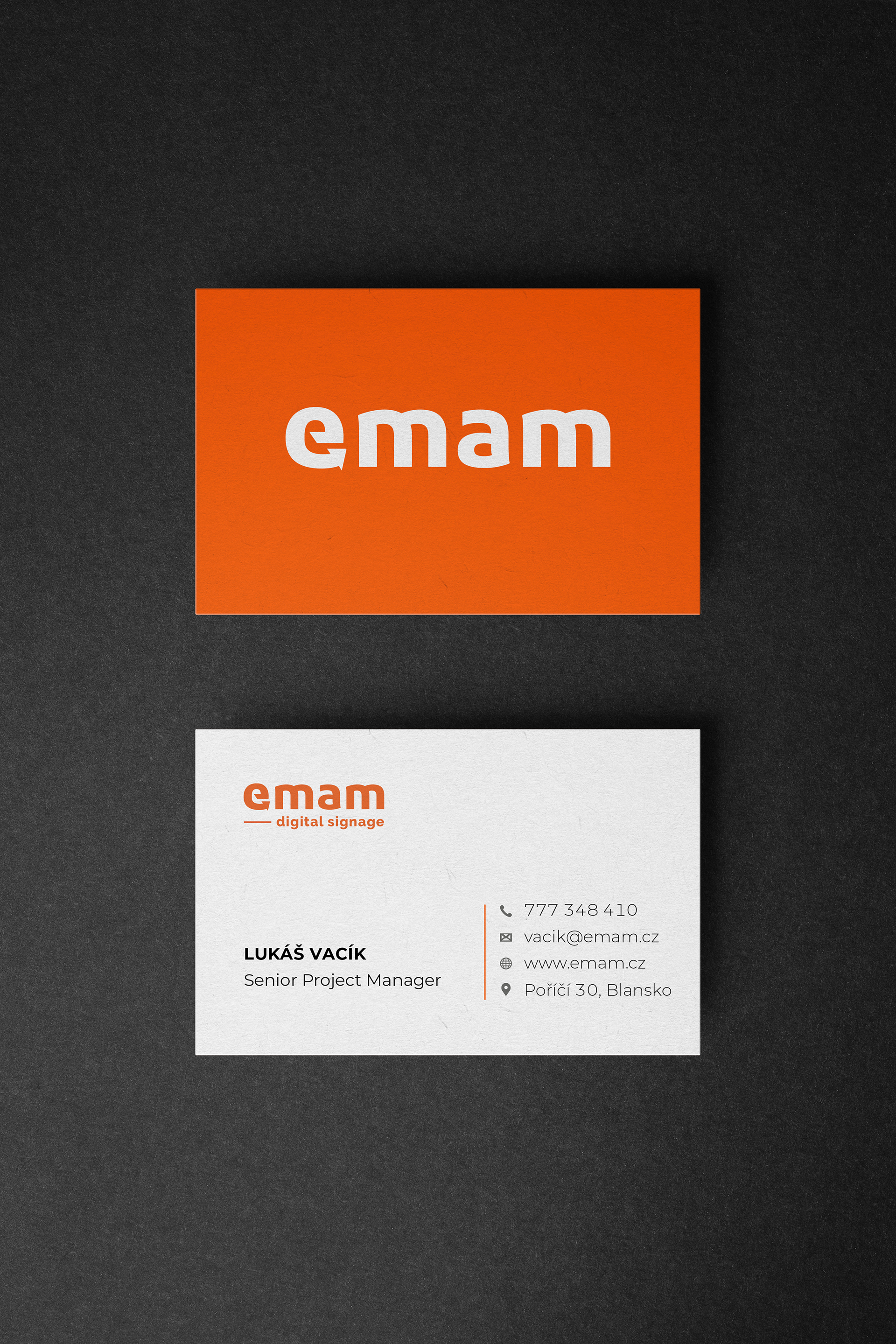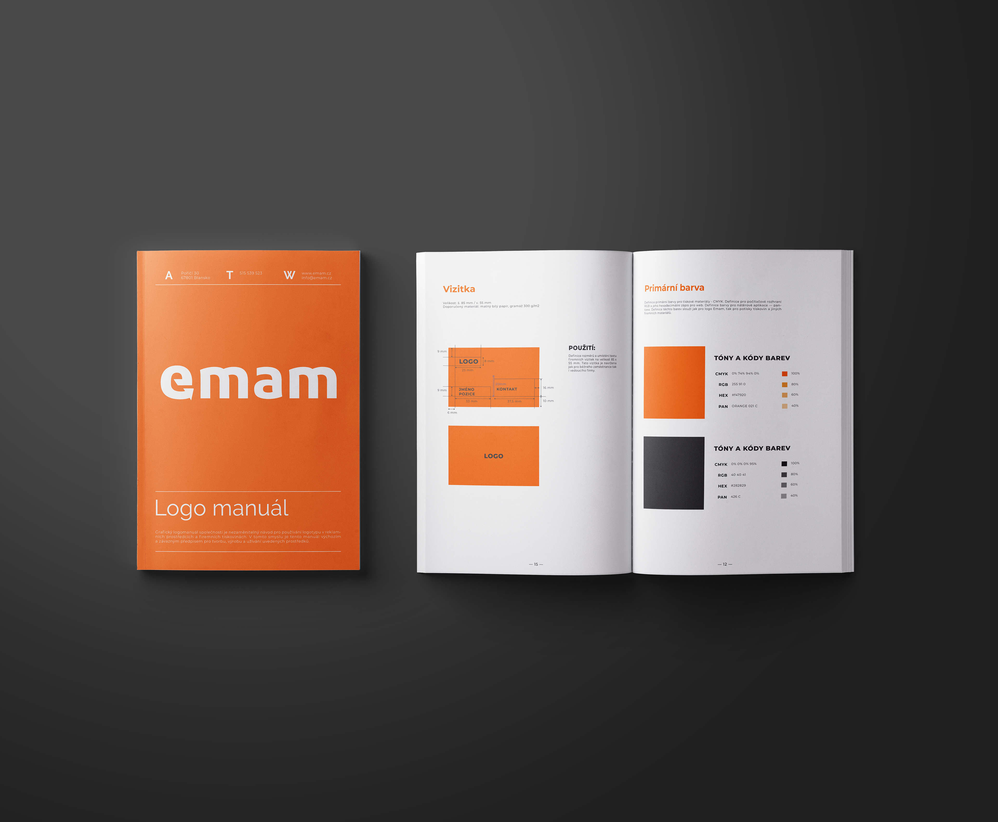

As part of the overall rebranding of the brand, a high-quality logo manual, business card design, and other printed materials were essential.


To strengthen the overall brand presence of Emam and create a cohesive visual identity, a comprehensive redesign was undertaken. As part of this, we focused on optimizing the company’s branding, starting with a facelift of the logo and extending to all printed materials. Emam’s distinctive visual element—a vibrant orange color and an arrow symbolizing digitization—was reworked. The arrow cleverly transformed into the initial letter 'E,' simplifying the logo and enhancing its readability.
