


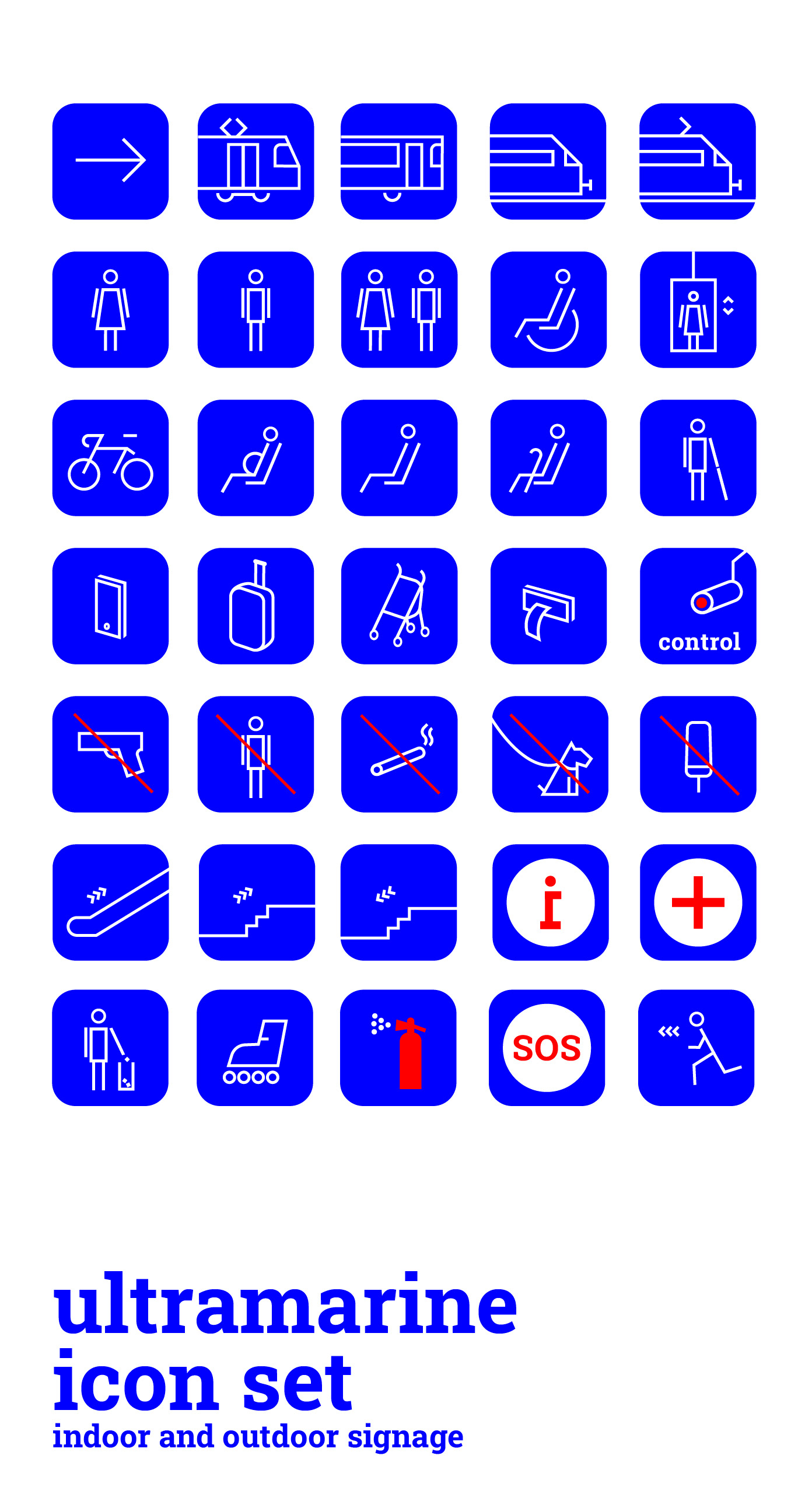
Ultramarínový lineární set ikon vytvořen pro projekt národního dopravce.
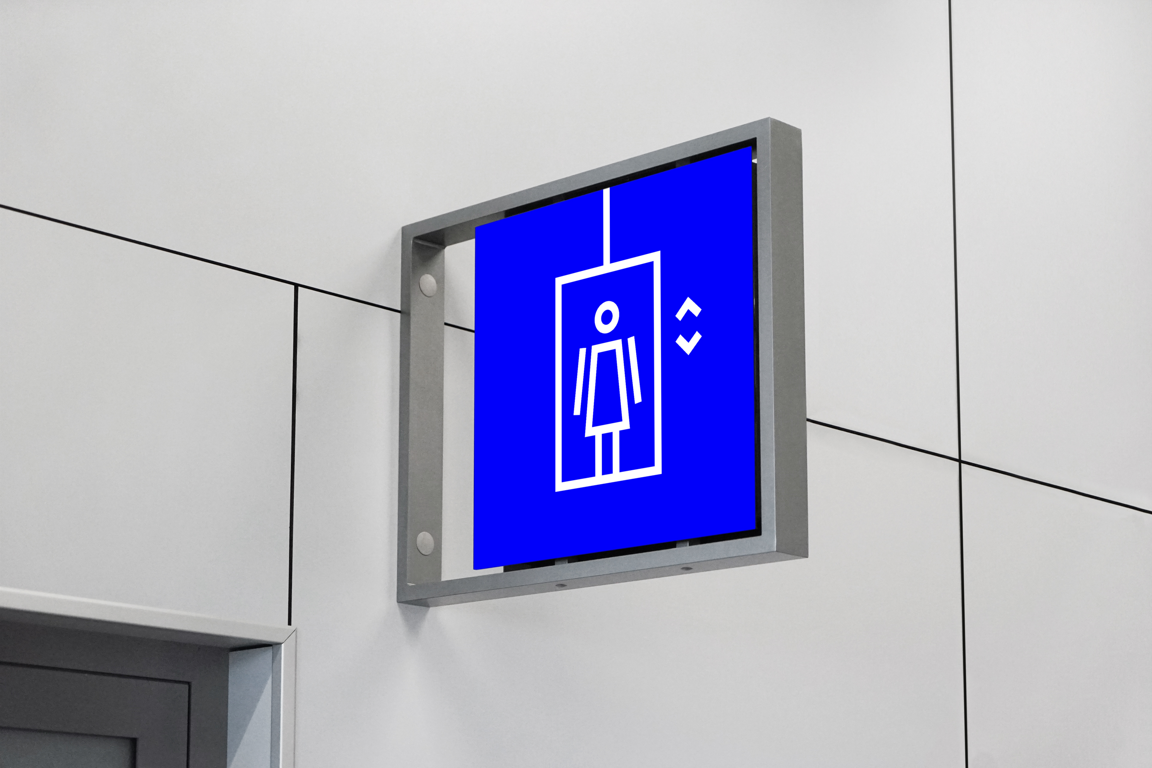
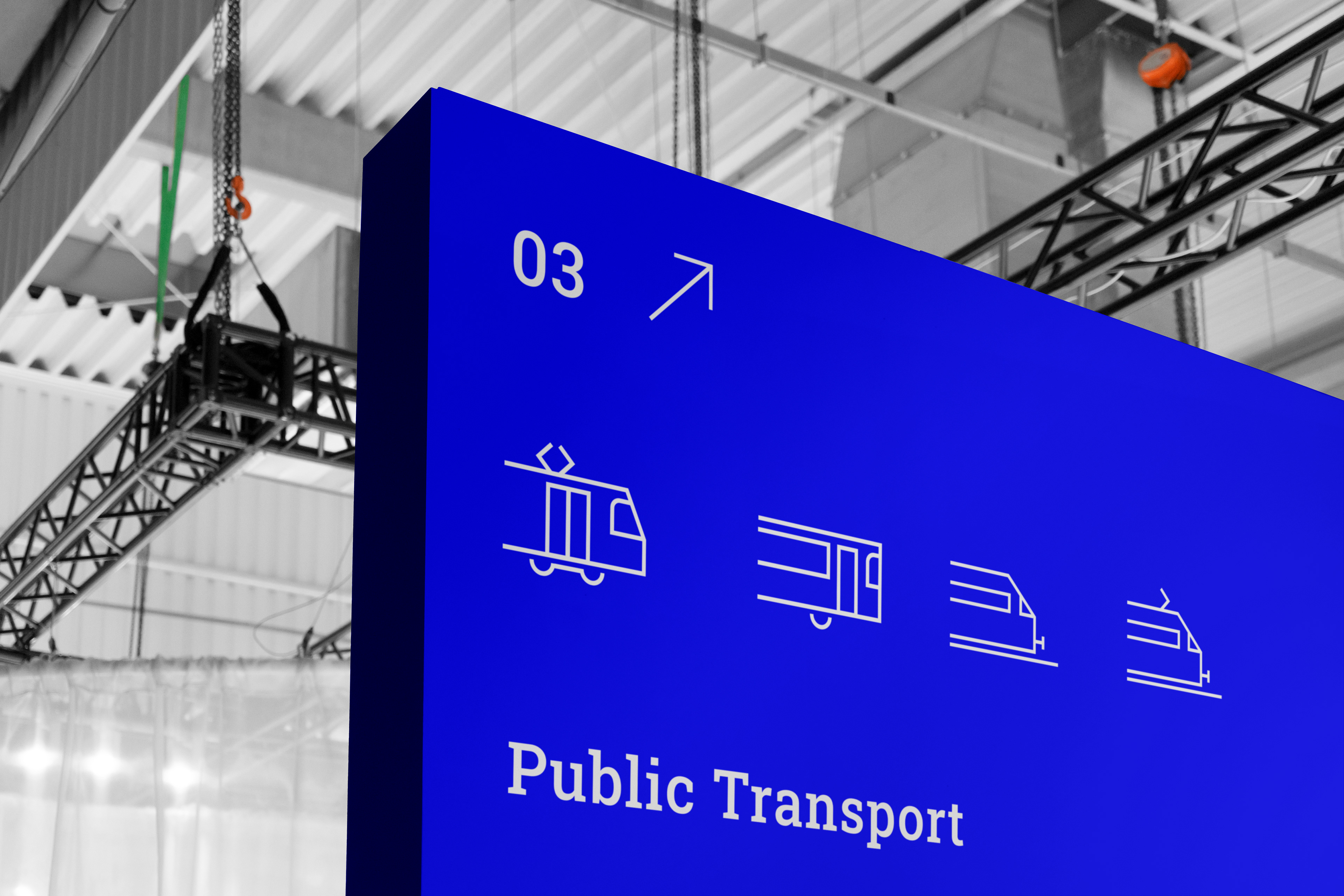
A minimalist icon set designed for the visual identity of the national carrier, combining simplicity with functionality. The use of ultramarine blue, a key element of the client’s corporate palette, emphasizes trustworthiness and professionalism. Each icon was crafted with a focus on clarity, consistent geometry, and ease of use across both digital and print applications. This set was created as part of a broader design system and serves to guide passengers as well as support internal communication. The icon style reflects a modern, friendly, and highly legible approach to public space communication.